Saturday, September 6, 2008

The Message Conveyed by My Poster.


Actually, before starting this illustration, I actually got my inspiration from a picture I downloaded from net some time ago. Here it's...


The reason I made this poster is to convey message --
"Cease the fire and Love the Trees".

Why is it so ? Well, in this picture, I really wished to arouse people's awareness in protecting the nature by stopping the open air burning. That's why, my minor description for this poster is
"Give the chance to our children to witness the beauty of our world and to fall in love with it."

Except for the fire, I applied fair colors to everything in this poster to symbolize the harmony of the nature.

For the water poured into the box, I applied different kind of blue colors to show the different layers of the water.

For the fire, I used a dimmer orange and yellow instead of the original colors to show the ceasing of fire.

In this poster, the fire is placed into a big box and it's poured with water. The reason of me placing the fire this way, is to indicate that open air burning can actually be controlled easily, it's just depending on our wish.

As for the contrast, I decorated a very harmonic scenery of a bunch of kids playing around a big and beautiful tree and at the same time, protecting the tree.

For the kids' Tee shirt, I applied only green and white colors to show the enthusiasm of theirs in protecting the nature.

While for the green land, I applied a very light green color to show the healthy condition of the field.

At last, I applied very light blue color for the sky, and gradient is applied as well to show the sunny day when the children are having their sweet moment playing with each other.


Friday, September 5, 2008

My 3rd Assignment: "Cease the Fire, Love the Trees."


Finally, after days of hardwork, it was completely done. ^^
This poster was basically about ceasing the open air burning, and encouraging people to participate more in those tree planting.
I really want to thank those friends who helped in giving me comment previously when i was on my way in making this poster. Thanks once again.^^

So as what is shown in this poster, this poster is entitled:

"Cease the Fire, Love the Trees."


Anyway, don't mind dropping me some comments ya, so that I can absorb something and make some necessary improvement for my poster here. Thank you.

The making of The 3rd Assigment.


Since this is my final assignment for this trimester, therefore I really paid a lot of attention on this. Because of this, I did my research as usual and I've drawn a big amount of sketches, a lot more than the previous ones. Finally, I've come out with one sketch which is more preferable. Here this is.


After I've picked my favourite sketch, I began my poster illustration. Since I very much loved the tree in my 2nd assignment, therefore I decided to paste it on my poster. Along with that, I started to draw the outline of the box using pen tool. While for the fire in that box, I decided to paste in my sketch and trace the shape of the fire using the pen tool again.


Well, the shape of the fire and the box were done, and it was time to start drawing the kids around the tree, therefore I drew the shape of an ellipse on a new layer using ellipse tool so that I could roughly estimate the position of those kids. After that, I started drawing some circles on the eclipse to represent the heads of those kids.


Okay, here comes the difficult part. At first, I applied the shape of rectangular, using rectangular tool to be the kids' bodies. Then, by using pen tool and pencil tool, I drew their hair, eyes, mouths, noses, hands and legs. After forming out the shape, I applied direct selection tool and warp tool to sort of altering their body parts into a better shape. To be frank, the illustration of those kids was seriously the most time consuming session, even though with the help of the zoom tool, but still, it was hard, as i had to draw every single detailed part of theirs. Oh ya, there was some time i copied and pasted some of the body parts and reflected it, for example, when I wanted a pair of hand with the same length, I just did that method.


After the kids were drawn, it was time to do the coloring. ^^
In this part, I decided to apply only some fair colors, to carry out the sense of harmony in this poster, except for the fire of course. While for the kids, I applied white and green color for their dressing.


As my title is "Cease the Fire, Loves the Trees", therefore I really wished to show the ceasing of fire in this poster of mine. So I applied pen tool again to draw a container which shows an big amount of water being poured from that two big containers. To draw that, I applied just rectangular tool and alter the shape a little bit using that direct selection tool. After wards, I copied it and pasted the same container and reflected it before placing it on the right hand side. Followed by that, I applied pen tool to draw the shape of the water when it was being poured into that box filled wit fire. Since the water is kinda shapeless, so it was a difficult part for me as well, and i spent alot of time in this. Once it was drawn, I applied light blue for the water and I adjusted the capacity of that color to a lower percentage.


Once it was done, here came the touch up part. I deleted the original green background and redrew again using pen tool, but this time with some grass on that background so that it can really show that it was a greenland. Other than that, to make the poster nicer, i added shadow into every object. Then I added a very light blue color as for the sky color, then I applied gradient effect on that piece of sky with the setting of 90' linear.


It almost came to the end of the whole process already. For the last part, I added the main title of this project of mine which is " Cease the Fire, Love the Trees", using some specific font I downloaded from the website.


Finally, it was done. So, enjoy. ^^


Wednesday, September 3, 2008

The Ideation and Sketches.

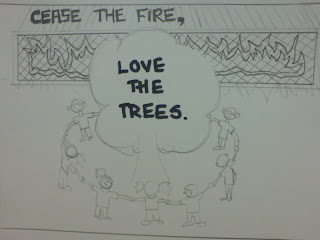
Okay, now, sketches have been done, and I do think that I've successfully convey the same message as my previous assignments into this final assignment for this trimester. So, basically, these sketches of mine are symbolizing the importance of loving trees and ceasing open air burning.

I've done alot of sketches, but it seems like there are only 3 of them are in my liking. So, i've decided to post it out here. So here u go. ^^

1. This sketches was drawn by me to show different kind of contributions which we can make to stop global warming.


2. Well, in this sketch, it's more like showing people about the between the beauty of an unharmed nature and the ease of trees caused by open air burning. This is to show people about the consequence that will be happening based on the choice that we are gonna make.


3. This is my favorite. As it shows the happiness of those kids when they are playing around the tree. It symbolizes the intimate relationship between human beings and the nature. with the harmful fire caused by open air burning getting locked up in a container, waiting to be ceased.


So now, the sketches are done, and I've got myself a concept already. So here I go for the 3rd assignment of mine, THE POSTER. Wait for my good news. ^^

Tuesday, September 2, 2008

The Assignment 3. The Introduction.


Phew, finally I’ve finished my DF assignment…So now it’s time to focus on my computer graphic. Hee…

Previously, I’ve done some researches for my CG, and of course, all of them are related to my topic, which is bout open air burning. So here it goes:


Well, for my assignment, I’m going to focus on my basic concept, is that to arouse the awareness among people about open air burning and sort of persuading them to cease that practice, instead of scaring people about how soon we are going to extinct. Lol….


So, here goes my CG assignment. ^^


The Project Charter of Assignment 3.


Assignment 3 Title: Cease Burning, Love the Trees.


Project Start Date: August 19, 2008
Projected Finish Date: September 9, 2008.

Project Manager: Wong Jue Jin HP: 0165065683 Email: wongjuejin@yahoo.com

Project Objectives:

The 3rd assignment that I am doing right now is to convey a message to arouse the awareness among humanity about how important it’s to cease burning in jungle and also in public areas in order to avoid global warning. Besides that, through this poster, I wish that I can as well emphasize the importance of the existence of trees in this nature. That’s why my title is “Cease Burning, Love the Trees”.
Well, for my 1st assignment, there is a tree held by a human's hand and a fire contained in a box to show this idea as well, while for my 2nd assignment, I illustrated a scenery of a beautiful tree and some landscapes of green lands behind that tree to show how beauty our earth will be if we stop the open air burning, especially in the jungle. So, with these both assignments I've done, I decided to carry on with my idea or concept to emphasize more on the ceasing of open air burning and the beauty of nature. Therefore, I will input more trees and controlled fire in the 3rd assignment that I am handling now.

Approach:

• Pen tool, pencil tool, shape tool and also warp tool will be used to illustrate the shape of fire and trees in this poster. A lot of time will be spent in this part as it is main part of my whole assignment, therefore, effort must be put into this to create something that allow me to really convey the message that I want to, which is similar to my title of this assignment.
• Gradient tool, mesh tool and live paint bucket will be applied as well to add suitable colors into my poster so that it can attract attention from other people. Of course, during the process, color will be picked carefully so that it can avoid from creating a dull image and help to achieve the best performance of this poster.
• Type tool will be applied too for the title of this poster. Since it’s one which implies the whole message of this poster, so suitable font must be picked carefully as well, so maybe I’ll try to surf the net and download some font which is more suitable for my poster.

Roles and Responsibilities:

• For the first few days, which are from 19th August until 22nd August, I’ll spend some time to think of the basic concept of my poster. During this, I’ll do some researches from net and also books in library which were recommended by some of my friends and lecturers.
• After that, I’ll start making my sketches from 23rd August until 25th August according to my inspiration after referring those posters that I got from the net and also the books.
• 26th August until 31st August, I’ll start illustrating the poster based on my final sketch. According to my own experience, I believe that this is going to spend more time compared to the other steps. That’s why I’ve spare one or two days more for this so that I can focus more on this illustration.
• Beginning of 1st September, I’ll allow myself to spend about 4th September in coloring those illustration that I’ve done in the previous days.
• On the 5th September, I’ll spend whole day in writing the essay to explain the message that my poster is indicating and also write my name, ID and the others information in the correct sequence.
• On the 6th September, I’ll start asking my classmates and consulting my lecturer about the poster I’ve made, if there’s no problem left, I’ll get it printed on 7th September and wait to submit it on the 9th September.
• However, if there’s any problem, I’ll get it fixed right away on 6th and 7th September and get it printed on 8th September. After that, I’ll be just waiting for 9th September to submit my work.


Comment:

• During the computer class on 26th August, I’ve got to know that we can actually get the idea of our posters from those books in MMU library as it contains a lot of poster designs which couldn’t be found on the net. So I am going to try on that to see whether there is any altering I can do on my current sketch.
• On 26th August, our computer graphic teacher brought us to another lecturer in one of the offices in FCM, and she provided some methods that we can actually apply in Adobe Illustrator CS3. For example, we can actually write those words according to a path that we want by just creating a path first before we start writing our title on that piece of illustration, so I am going to try on that as well to see what the outcome will be, then only decide which method that I want to use.


Monday, August 18, 2008

What is meant by my ILLUSTRATION ?


This illustration that I’ve done for this second assignment is entitled


“THE BEAUTY OF NATURE


In this illustration, the landscapes of green land and some trees were drawn to show people about the beauty of nature. Open air burning has affected the growth of trees in jungle, and it has later on caused the easing of trees and ultimately the global warming. Therefore this illustration was done to remind people about the importance of maintaining the beauty of nature.


For the sky, a very light blue color was applied to signify the bright and sunny day. It also represented the cleanliness of the air and sort of reminding people about how purified our air will be if there’s no any open air burning happening which is the main “contributor” to global warming.


Black color which the capacity was lessened was applied as the trees’ shadows. Those shadows were drawn as the outcome of the natural sunlight during the sunny day and it helped in showing the scenery of beautiful green lands in a very relieving morning.


For the trunks of those trees, few mixtures of brown colors were applied to indicate the healthy condition of those trunks in this polluted free green land.


Besides that, different kinds of green colors were applied as well. It’s to create the layering effect of those green lands I’ve drawn. In fact, the major color applied for this illustration was mainly green, for example, the bushes, trees, and the grass. Green played an important role in showing people about how beautiful and refreshing nature is without open air burning.


Earth is in fact the most important thing to human beings, without the earth, there will be no us, so it’s a must for us to start saving the planet before we really lose the only precious thing of ours. Therefore, in this illustration, it was basically arousing the awareness of human beings about how we are going to beautify the nature, by stopping the open air burning, of course.


Friday, August 15, 2008

My Illustration-"BEAUTY of NATURE".


Here is my final artwork for the 2nd assignment~!!
I've to admit, this assignment is so fun~!!
I learnt alot from this assignment. Although the process is pretty hard, but still, with my friend's help, i finally come out with this illustration~!!
It has a name ya. I called it the

"BEAUTY of NATURE".


*p/s : The process of making this was pretty hard. Therefore, i explained the process in a more detailed way, so hope that it could help those classmates who were facing the same problem like me. Enjoy~^^

The Process.


For my second assignment, i've viewed alot of pictures from the website, and i've drawn myself some sketches as well. After considering, i decided to illustrate using one of my sketches.


For the 1st step, i pasted the picture in illustrator as the 1st layer and it was dimmed to only 30% so that i could clearly see the outline of this sketch. After that, i started to trace the image and draw the outline of the tree and the trunk using the pen tool. During that, the warp tool was used as well to alter the tree to a better shape.


After that, colours were added to the tree and also the greenland that i've just drawn using the same method. The greenland was drawn on another layer behind the tree so that it wouldn't overlap the image of that tree. The drawing of that greenland took me more time as i wanted to draw the grass on that layer one by one.


Once it was done, another layer was added to draw another piece of greenland right behind the tree, by using the same method as well, in this, different green colors were applied on the bushes to distinguish it from the greenland. This method was applied on the following layers as well to precisely show the real landscape of this illustration of mine.


Afterward, i started to go for the bushes and the small tree on the 10th layer. This layer took me alot of time as well dunno why. Maybe i wasted too much time in fixing that tree to a shape i wanted as the previous few outcomes weren't actually in my liking. Plus, the trunk, it took me some time too, as it was pretty hard to draw on such a tiny trunk. Oh ya, almost forgot to tell, i added colors after that. So, here you go.


Later on, another layer at the back of that "tree and bushes" layer was created to draw another piece of greenland which is also the last piece. Same method was applied once again but of course, with different kind of green color.


Okay, now, time for the sky. ^^
In this, another layer was created again, which was the last layer also. Then, a very light blue color was added, and then the gradient of that color was changed to Linear type with 270 as the degree in the small box on right hand side. On this layer, a small tree from the symbol column was applied too to create a "jungle-ish" environment.


So, until now, the basic view can be seen already, so it was time to beautify the illustration already. For the tree at the front, pencil tool was applied to draw some curves to represent leaves. Warp tool was used as well to make those curves to a better shape. Then, grass and flowers from the symbol column were applied too around the tree to sort of beautifying the tree abit. ^^
Shadow of both trees were created too, by using pencil tool. Then, black color was filled into the shadow i drew and the outline was disabled. Then to make it looks more real, i reduce the color capacity to 30 odd percentage only. As i said, i want this illustration to be more "jungle-ish", therefore, after awhile, i decided to add more trees on the last layer. hehe...


After that, the symbol from my previous assignment was pasted on that 1st layer, and the scale was reduced to make it looks smaller. Then it was placed on the right bottom of that illustration. Here, that's how my 2nd assignment was done. ^^


Wednesday, July 30, 2008

The Ideation and The Sketches.

Well, after referring to some pictures I've found from the google, I've thought for some time about the basic idea. Since my topic about global warning is Open Air Burning, and I focused mainly on the burning trees, therefore, my basic ideation for my 2nd assignment will be a large and healthy tree on a piece of green land, and some nice landscape behind that particular tree.

This time, I decided to bring out the real scenery of the 2nd assignment instead of applying some cartonised item. So, based on this basic idea and concept, I've come out with 3 sketches of mine. So here they are...


Okie dokie, Here Comes The 2nd Assignment. ^^

Well, the 1st assignment has been submitted now, and we got back the printout as well during my computer graphic class this week. Without giving a break, here comes another assignment.

Basically, in this assignment, we were asked to create an illustration based on the area of the topic we were mentioning during the 1st assignment. So in my case, I'll have to draw a big big tree in a piece of green land. In order to make my 2nd assignment a success, I've done some research online, and I've even downloaded some pictures or photos taken as my references.

So, here's the pictures, enjoy.^^